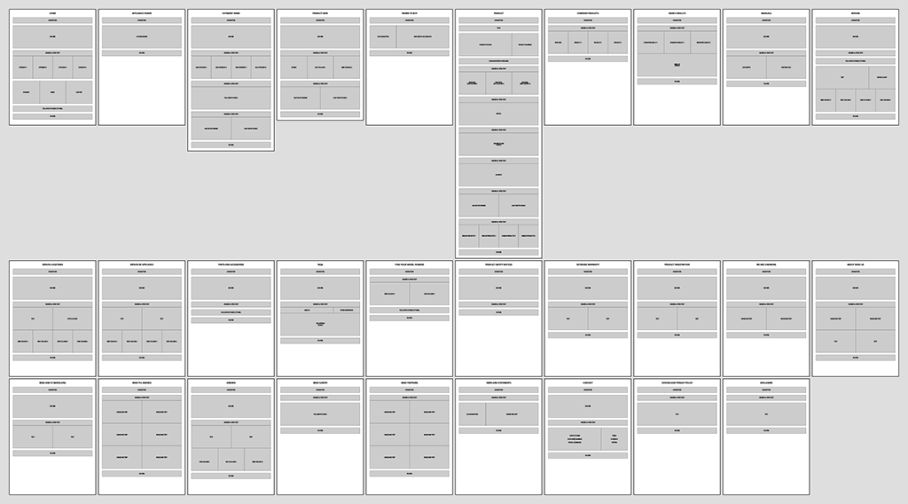
Wireframes:
The new website first needs to be planned out in wireframe, determining what pages are needed, what goes on each page, and generally where on the page each content block goes. This is for my own benefit, as well as the developer.
As well as the Wireframe, I also supply detailed annotated mockups to the developer – see an example here.
A General Overview:
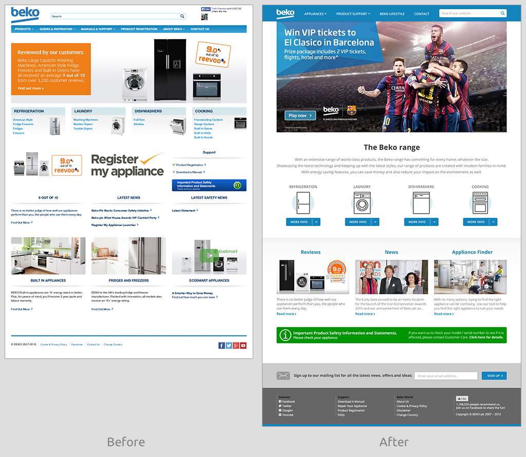
The new website has been given a lot more white-space and clarity and a definite structure. Previously it was too cramped and busy and confusing. Additionally, a lot of dead-weight not-very-useful content has been removed.
Open-Sans, a modern clean stylish web-font has been introduced, rather than relying on the system-installed browser default.
The size of the text has been increased. Several new styles of different sizes & weights and colours have been introduced, defining areas such as main header, sub-header, opening full-width paragraph, secondary-level narrower paragraph, etc. This helps define and distinguish different content blocks very easily. The previous site had just two weights/sizes for headers and paragraphs.
Also to help define and distinguish different content blocks, a full-width subtle gradient divider has been introduced to separate sections on the page (between the four appliance icons and the Review, News and Appliance Finder below).
The banner images at the top of each page have been enlarged.
The rotating carousel function of the banner images has been removed, and a single static image is shown instead. A carousel may be fine for sequential shots of products within the same category (such as a gallery of product shots), and I use it on my own portfolio to show off screenshots for each project, but it’s useless when showing off totally different unique and unrelated features, as these then become hidden, and the user has no way of knowing what else may be available to them. See here for more on this notion.
The main navigation block has been reversed to be white on blue, rather than blue on white, to make it stand out more, and to distinguish it from the rest of the content below.
The main navigation has been tidied up significantly: Several sections were combined or moved to the footer, reducing the number of links, the logo and search field were brought in line with the rest of the links, and the useless Facebook Likes figure was removed.
The footer at the base of the page was expanded to incorporate secondary-level links which were previously in the main navigation. Also a Mailing List sign-up option was incorporated into the footer.
Brief descriptive opening paragraphs have been added to the beginning of all sections, to give the customer an overview of the section, as well as to help the customer understand better what they are looking at.
Click here to see a full-size screenshot of the new Home page design.
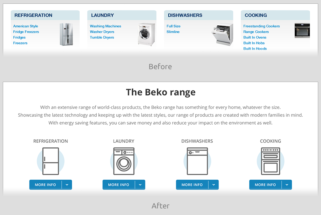
Home:
The appliance images have been iconised, rather than use photography, to bring a sense of uniformity to the range, where previously there was none.
The sub-categories under each product have been removed to maintain visual uniformity. They have been retained under the drop-down menus, however.
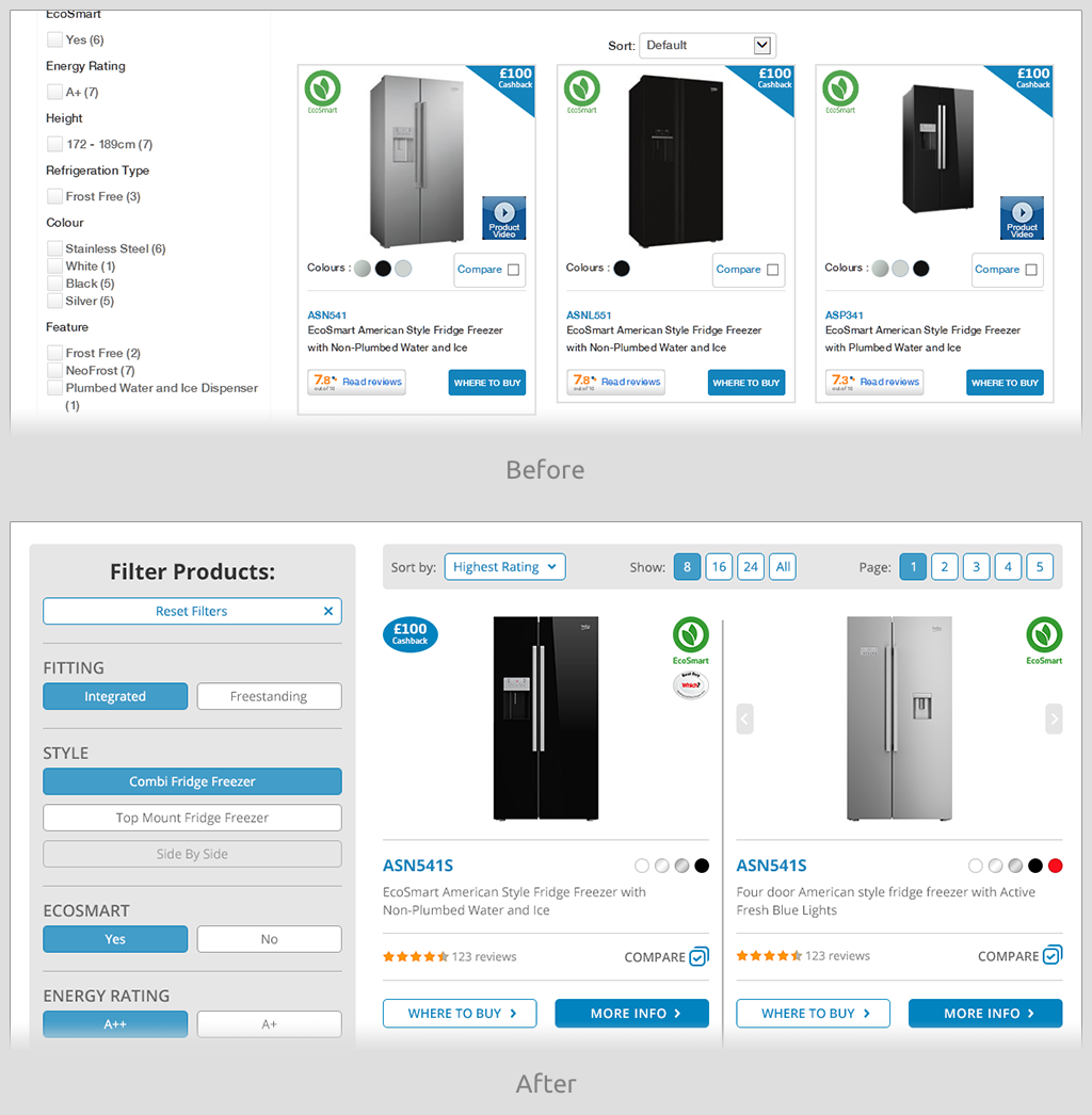
Product Grid:
The Product Grid was changed from 3-columns to 2-columns, as the previous system was too cramped, even on large desktops.
New sorting options and page numbering were introduced, where previously none existed.
An in-situ product thumbnail prev/next system was introduced on the Product Grid page, so multiple product shots can be viewed without having to click through to the actual detailed product page.
Click here to see a full-size screenshot of the new Product Grid design.
Product Grid – More Info:
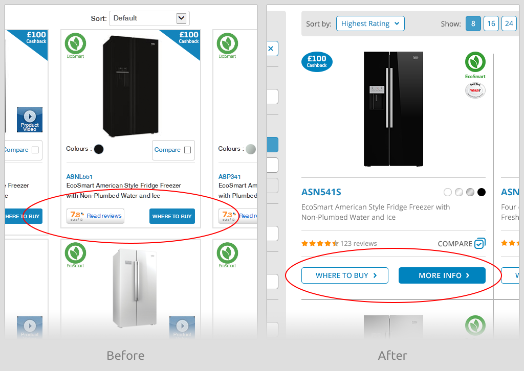
A simple MORE INFO button was added to the product grid, leading to the actual detailed product page. It may seem obvious, but previously the website relied only on users clicking on either the product-shot or the product-name text link. However, as there was already a WHERE TO BUY button (which leads to an external site) which stands out quite visibly, this led to customer confusion on where to click. To help our own button stand out more, the Buy button was redesigned to give it a second-choice appearance.
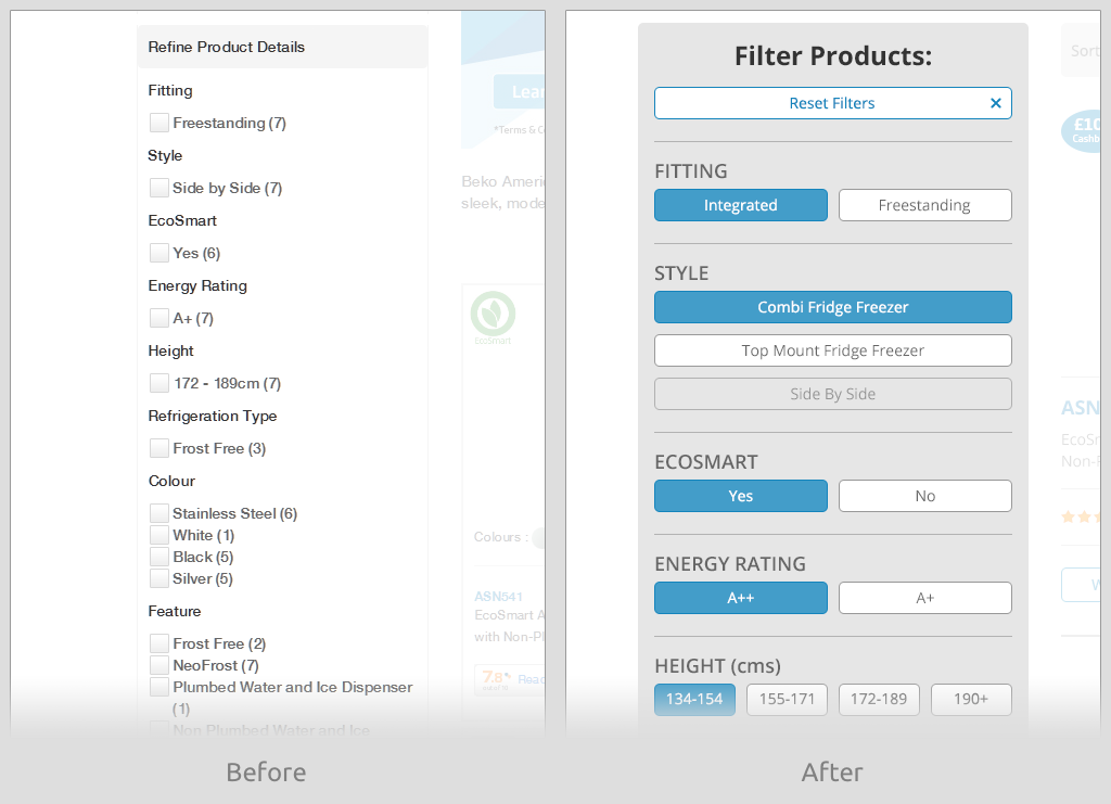
Product Grid – Filters (Desktop):
The filtering system was completely overhauled and modernised, whilst also making it easier and more intuitive to use, as well as much more aesthetically pleasing. Filters can be turned on (from grey to blue), and if any options are chosen that make other filters unavailable, then those unavailable filters will be dimmed and unaccessible.
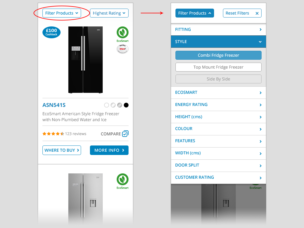
Product Grid – Filters (Mobile):
A new intuitive concertina-style Filter system designed specifically for smaller mobile device screens has been introduced. Previously it was dropped on mobile, as it was deemed too complicated to use the same filtering system for smaller screens.
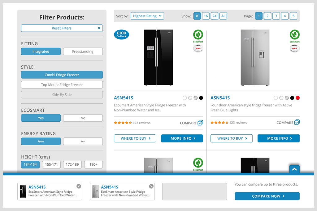
Product Grid – Compare:
An extremely intuitive Compare system (that actually works) was introduced. As the Compare checkbox is ticked next to a product, a small panel that is pinned to the bottom of the browser window slides up showing what has been selected. Additional products can then be selected or removed, and then finally compared.
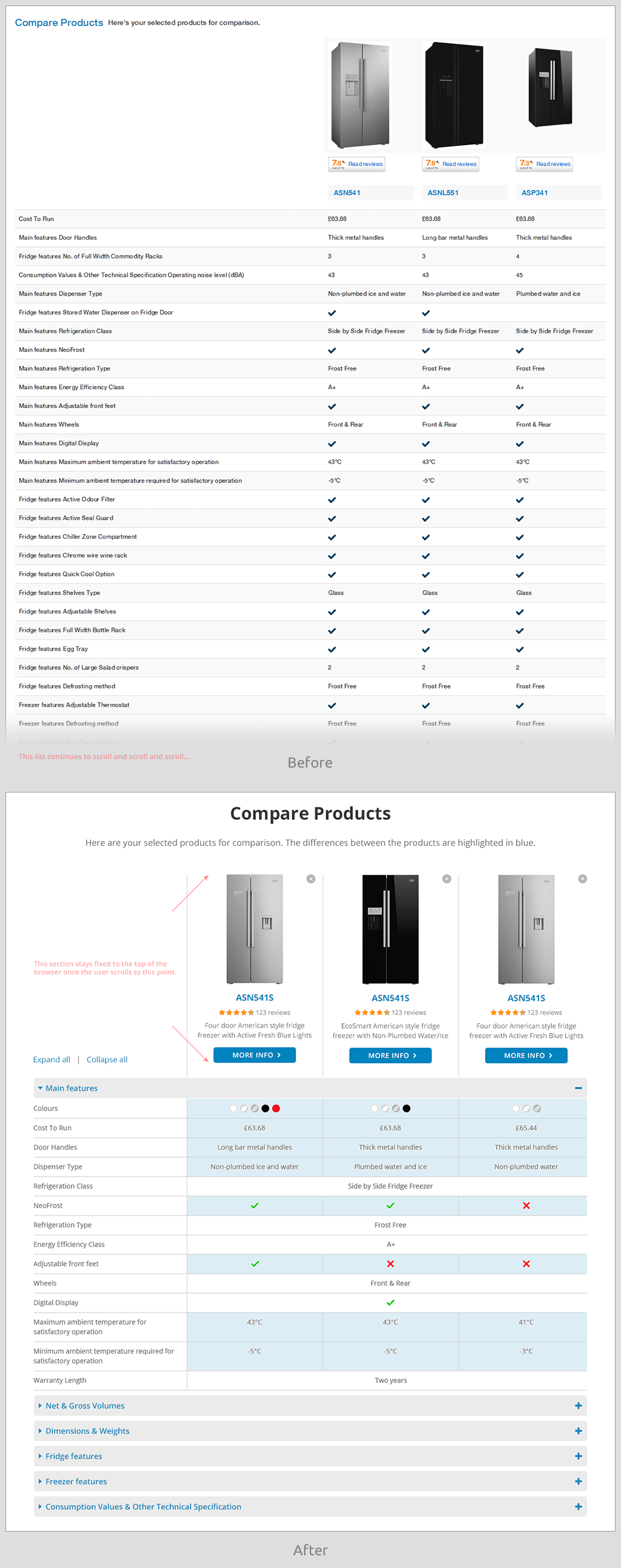
Compare Products:
On the new Compare Products page, differences are highlighted in blue for immediate and easy distinction of what’s different between products and what’s not, ie: the criteria that really matters on a comparison page.
The products stay pinned to the top of the browser window as you scroll, so that you can constantly see the product that the data refers to.
Products can be removed from the comparison tool when viewing specs, to eliminate obvious non-choices and to still view the remaining products.
Click here to see a full-size screenshot of the new Compare page.
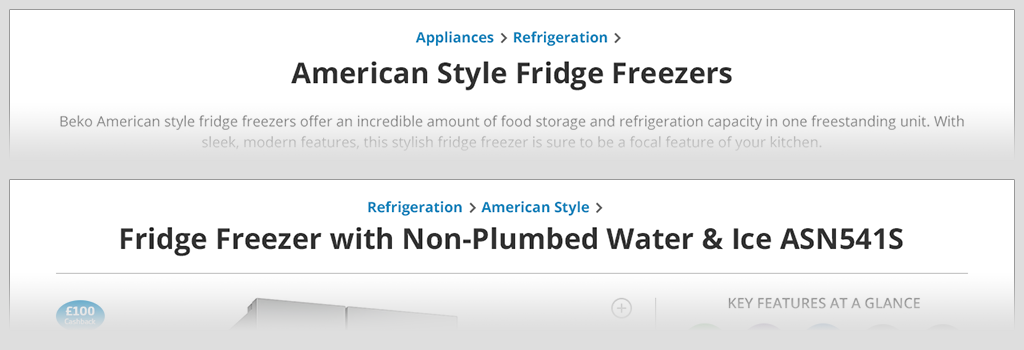
Product Pages – Breadcrumb:
A mini-breadcrumb has been implemented within the title area of the product page. The key point is that it is included with the product title, rather than as a separate navigation area, as some breadcrumbs are. This gives context to the product, ie: if you have drilled down several layers of sub-categories within a product, it lets you know which specific category you are in. It helps you to know where you are (if you landed here by a Google search or an email link, for example). It helps you jump back up one or two levels to view and compare other products within the same category or sub-category, independent of your browser’s back button and your viewing history.
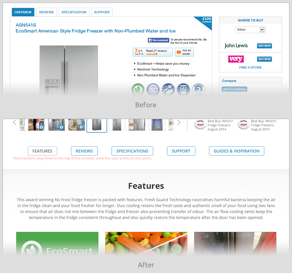
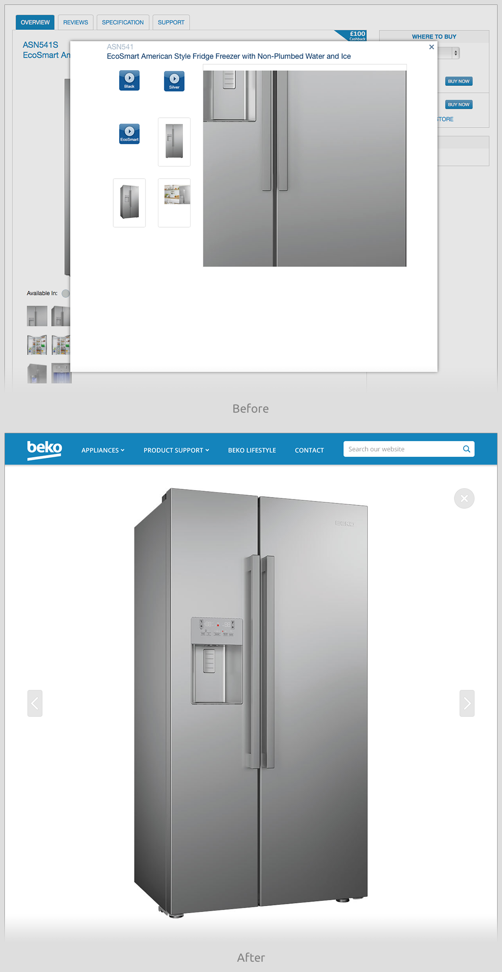
Product Page – Tabs:
The tabs from the previous design were removed. Tabs such as these do not fulfil their intended purpose, as firstly the content is initially hidden from the viewer, but more crucially, once the user starts to scroll down the page, then these tabs disappear from view entirely and are forgotten about. Even if they are remembered, the user has to scroll back up to the top of the page to access this content.
The content that was previously contained behind these tabs has been stacked further down the page. To gain quick access to these sections, a fixed-position in-page anchor-navigation system that is pinned to the top of the browser window (once the user scrolls to this point) has been introduced.
Click here to see a full-size screenshot of the new Product page.
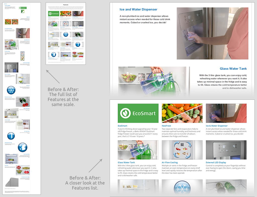
Product Page – Features:
The detailed Features section has been neatly compacted into a tidy 3-column grid. The previous system was full-width and ridiculously long to scroll.
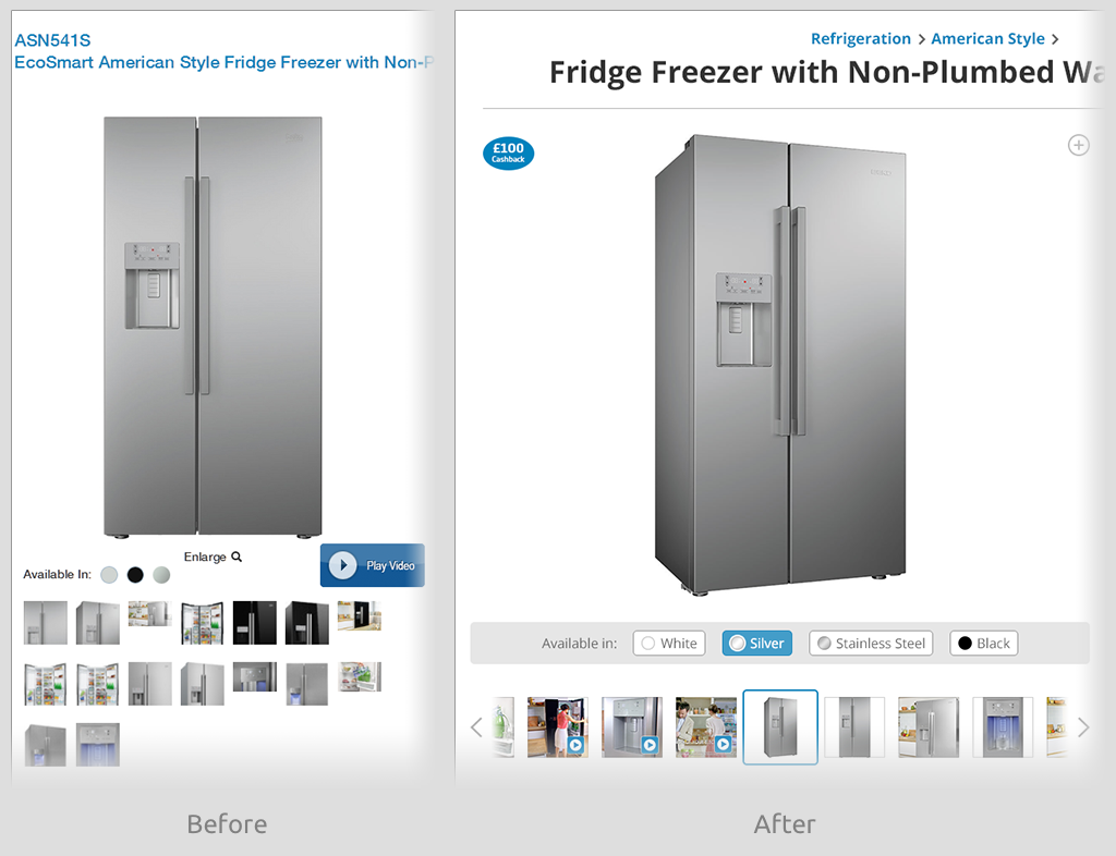
Product Page – Thumbnail Gallery (Desktop):
The product thumbnail gallery has been completely overhauled to make it neater and more visually appealing, whilst retaining intuitiveness. An in-situ side-scrolling strip has been adopted, rather than showing all the products at once.
The thumbnails themselves have all been made square and of a uniform size, regardless of whether the image it leads to is landscape or portrait.
A selector highlight has been added to show which thumbnail is currently selected.
Products within the gallery have been separated by product colour, and selecting a colour has been made easier and more obvious.

Product Page – Thumbnail Gallery (Mobile):
The thumbnails have been removed from the mobile screen, and a swipeable carousel of full-size images has been introduced. There are indicator dots below the image, displaying how many images there are and at what point in the line-up the user is.
Click here to see a full-size screenshot of the new mobile Product page.
Product Page – Image Zoom:
The product-zoom has been changed to be a full-page modal overlay, rather than the previous awkward pan-and-drag within a small modal pop-up window. Previous and Next arrows have been added within this full-screen view.
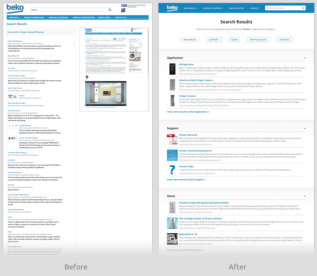
Search Results:
Search Results have been drastically overhauled. The results are now broken down into the top 3 relevant / promoted results within each category on the site, with a link to see more results within that category. The listings now also include imagery for all results.
The results are now much more relevant, rather than the previous system which just listed a random ordering of every single page containing an instance of the search term, no matter how irrelevant, totalling one long scrolling list of 100s of results all on one page.
At the bottom of the results page, there is now a clickable list of “Related search terms” to narrow down vague results.
Also introduced is a new smart-search as-you-type feature, bringing in both Recommended results and Related search terms. See an example of this feature here.
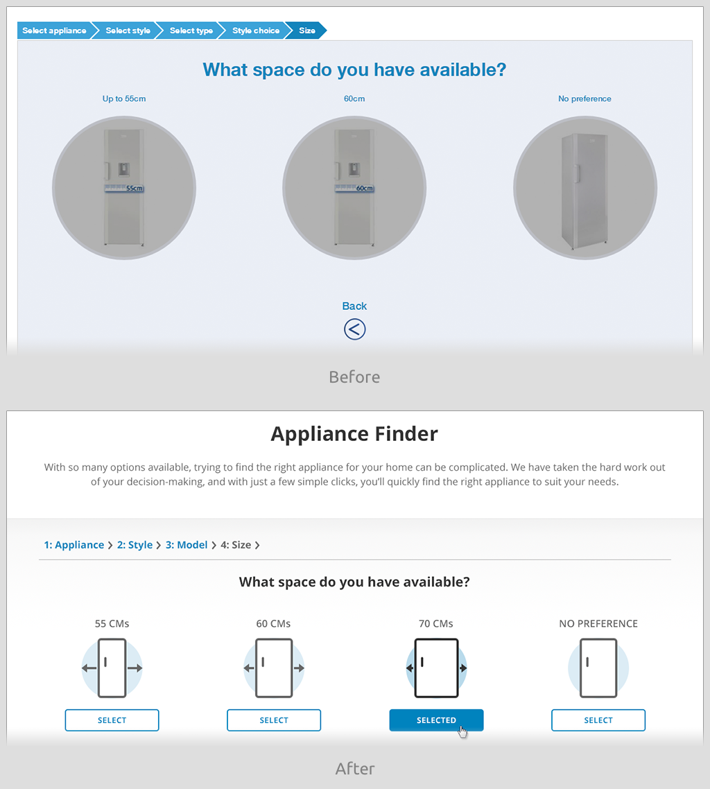
Appliance Finder:
The Appliance Finder tool has been tidied up. Iconography has been introduced to make distinctions between choices much more visually obvious.
The tool has been tailored to only show choices that could result in products being shown – the previous tool could return a result of “Not Products Matching Your Criteria Found”.
Click here to see a full-size screenshot of the new Appliance Finder page.


 Beko
Beko


