The Product:
A responsive redesign of the website for Beko, the UK's best-selling large home appliance brand.
Please note that this is the early stages of a work-in-progress project.
Responsibilities:
Based on the very basic structure of the client's existing website, I am the lead responsible for completely overhauling the look-and-feel, the new structure and the composition of the new website.
Being a responsive website, the designs had to take multiple resolutions into account, including desktop, tablet and mobile devices.
Please see a screenshot of the previous design of this page to compare.
See Also:
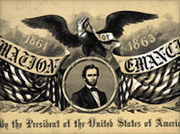 Timeline US Civil War
 Timeline: WW1
 London Unfurled
 FA Cup Archive
 Leisure
 Grundig
 Beko PLC
 Beko
Beko Beyond Ynth
 Chicken Raid
 Honey Hunters
 Parachute Panic
 Network Rail
 Mr Mahjong
 Iconography


